Creative Designer, Jess Atkinson, discusses the creative process behind the award winning design of Ownr
Welcome to the first installment of ReBrand by RBCx. In this three-part series, we will take you behind the scenes and into the minds of our top designers as they reconstruct their creative process. ReBrand will specifically feature how these designers rebranded current ventures within RBCx to create a new identity for these businesses.
By giving you insight into the process, our goal is to help make you a better designer by adopting some of the strategies taken by our team. We learn by sharing knowledge and information, and this series will be your front row seat into the minds of some of the best designers in the country.
Our first ReBrand features Creative Designer, Jess Atkinson. She led the rebrand for our one-stop-shop for entrepreneurs, Ownr, and won an award for its design. Jess breaks down her approach from start to finish, including how she tried out a new concept to gain approval from stakeholders.
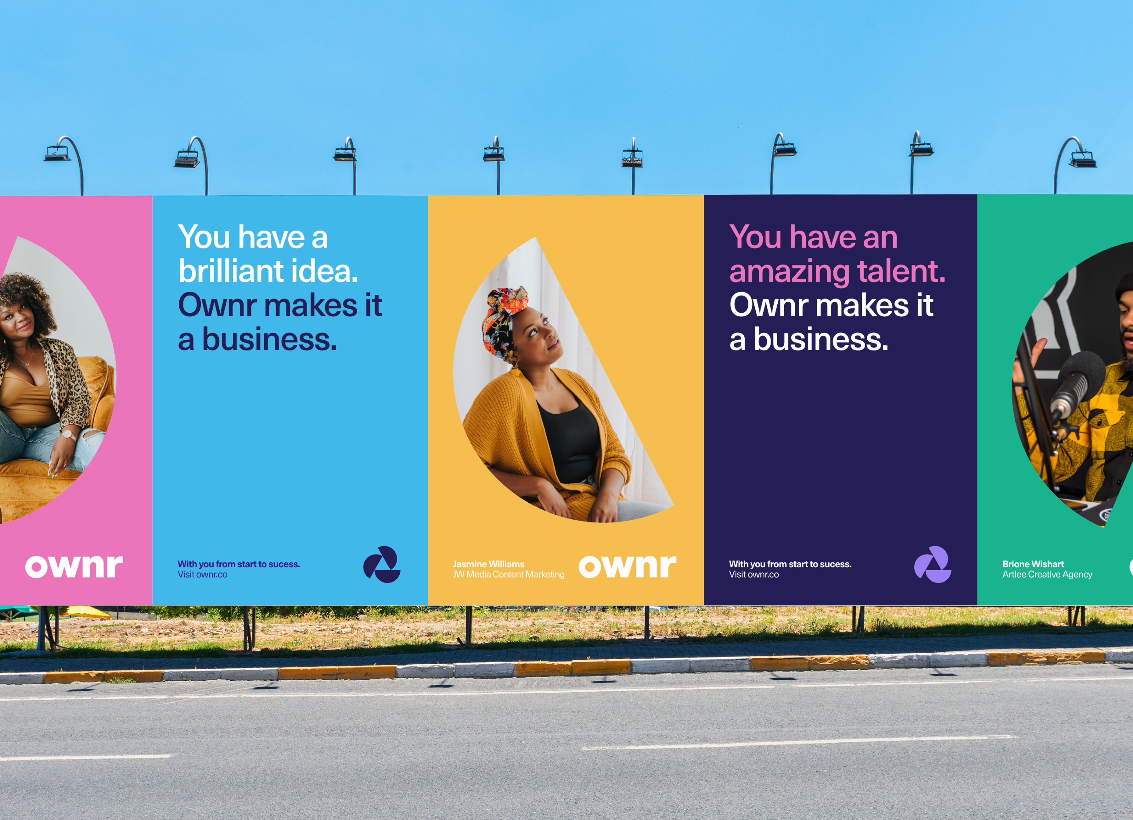 Ownr RGD Award entry, OOH campaign concept
ReBrand with Jess Atkinson
Jess: I was leading the project so I was quite involved from the very beginning. To ensure we made quick progress, I was trying out a method that would help us get quick alignment from a huge team. This was based on a method that Product Designers use called Silent Critiques. I’d show a bunch of work on a single page and have everyone leave comments with what they thought. They could digest the information how they want and I would try to moderate the conversation based on their comments. If people commented on one thing and really reacted, then I knew what was really exciting to them. I would dig a little deeper and ask more questions. And then if a lot of people hated something, I could go through and dig out that information and learn from it.
So this is what it looked like when I shared it with everyone on the Ownr team.
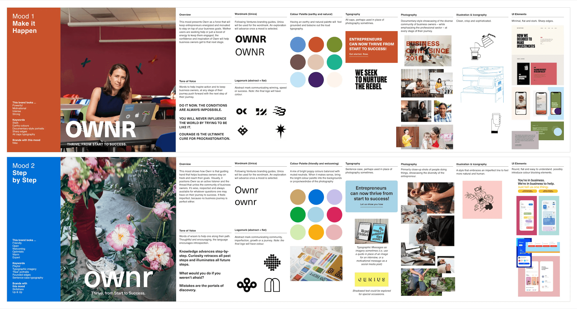
Ownr rebrand initial design, moodboards
They have instructions about the dos and don’ts of constructive feedback. Each week I would explain the goals, which I felt was really important to this feedback and the process, overall. Every designer is different. I like a combination of language and visuals when getting feedback, so for me, I start with words.

Ownr rebrand Figma file comments and feedback
From there, I can start building worlds based on that feedback. Intently, I can always look back at these comments to determine if my designs are on the right track.
The image here is very rough with typography. I pulled an image from the internet to show what the logo could look like and what the colour could feel like. This also provided hints of what the website could look like.
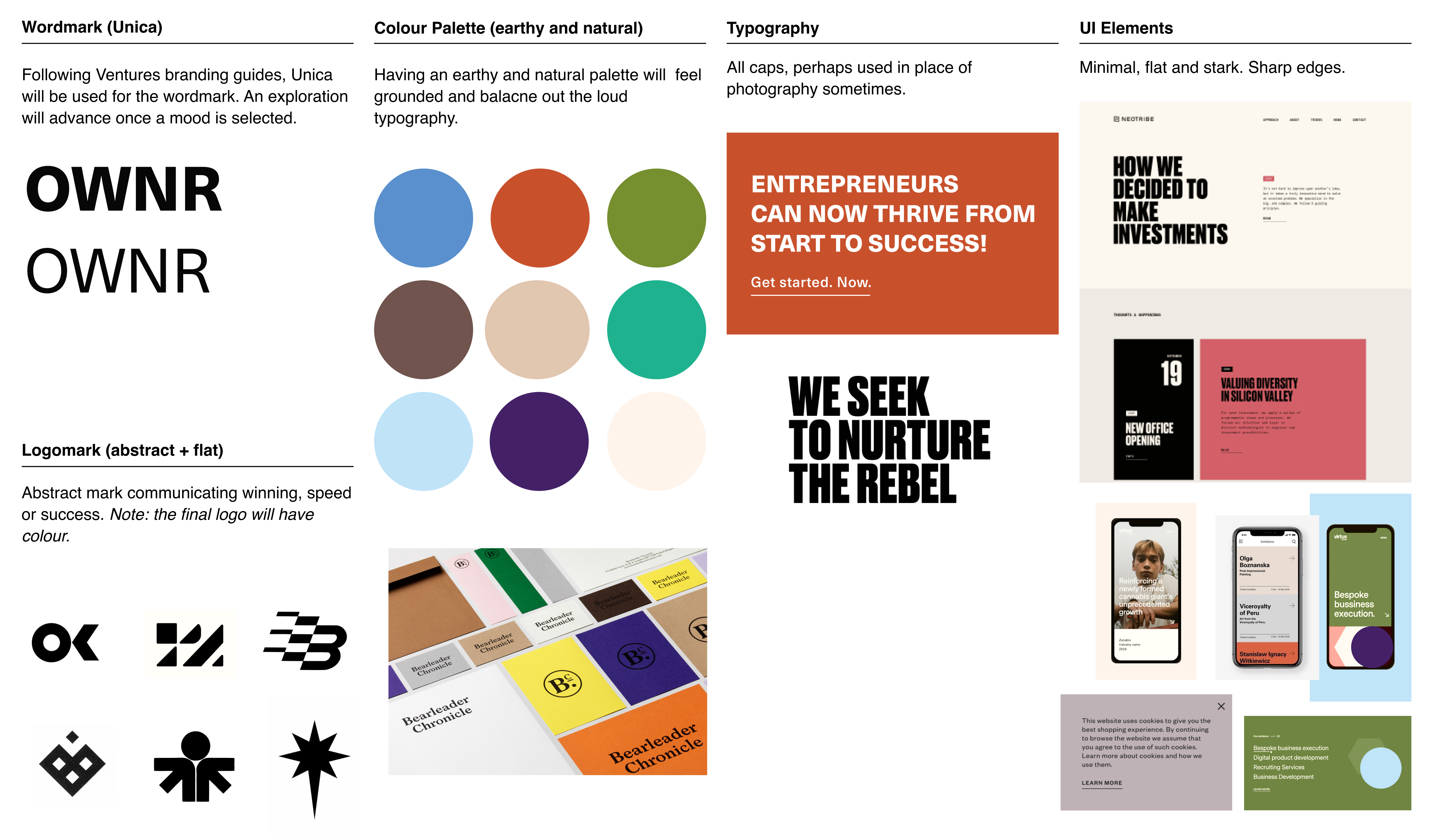
Typography and UI element inspiration for creating the new Ownr wordmark and website
This is the second iteration

Ownr rebrand, second iteration
This Silent Critique method was a lot easier for me to reign everyone in and to make sure we could all hear each other. [This technique] can be scary because you are essentially giving up the mystique of it all. With big presentations, there’s a lot of wow factor and it’s more of a spectacle. The Silent Critique method is very vulnerable in a way because it’s like the things you love and might want to develop further might be hated by the larger group. In the same way, it was very efficient because I didn’t spend ten hours designing something that I loved but that didn’t resonate with the team at all. Progress can feel slower, but no one is ever going completely off course, which can happen a lot with creative brand design.
The entire process took about six months. This is the original Ownr logo
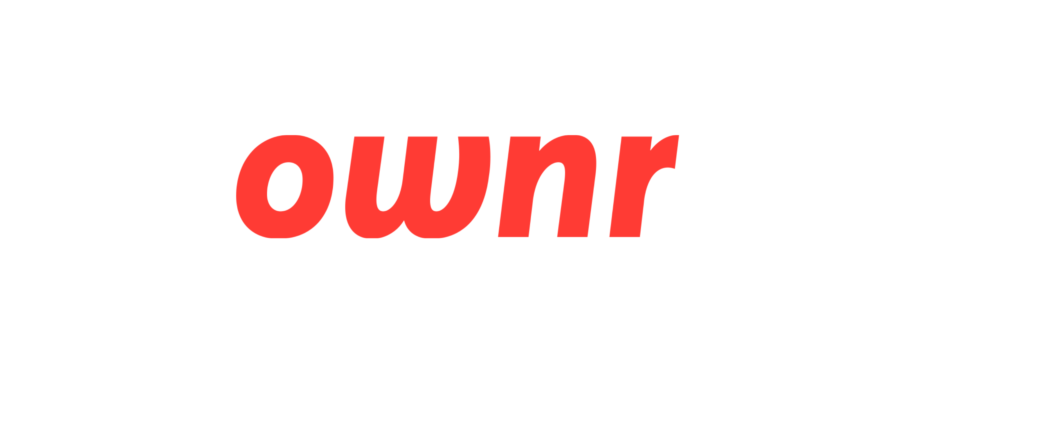
2009-2019 Original Ownr logo
Typography is always the hardest with logos. It’s also the hardest piece to get buy-in from stakeholders on. Here’s where we landed.
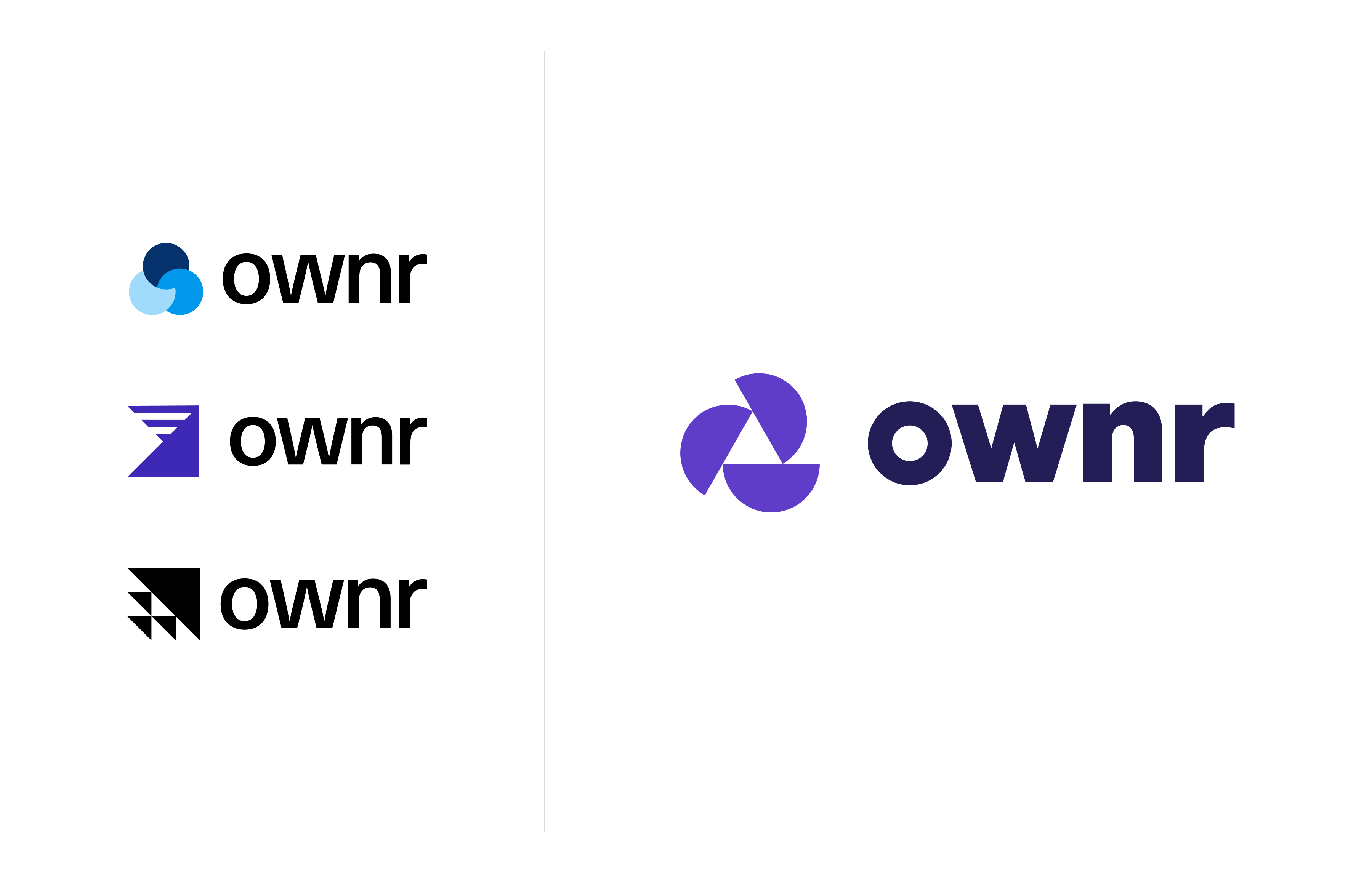
2020-present Ownr rebrand logo exploration and final logo
Product teams like to have frequent check-ins so it’s good when you can give them something to critique and get feedback on that aligns more closely with their meeting schedule.
I consolidated feedback three days after my very first meeting with the Product team. Then after that, it was about a week before I fleshed things out more.
In Summary
As you can see, redesigning any brand is a process. It has to go through several iterations until it gets to a place that expresses exactly what you want it to, in the way you want it to. Jess took a much more open and collaborative approach for this rebrand. As she mentions, it did make her feel more vulnerable but ultimately, she was willing to go there if it meant getting to a clearer solution in a more efficient way.
Key Takeaways:
- Don’t be afraid to let stakeholders in on your designs earlier in the process. You may not go the full Silent Critique route, but allowing stakeholders to assess your designs early helps keep the rebrand goals in alignment.
- Be patient. Rebranding is a process and even if you’re up against a short timeline, try not to skip steps. Tighten the duration between sprints and take your time through your process. You still want quality to prevail.
- Gather as much information and references as you can. Jess went from super general internet images to loose designs before narrowing down her focus. You want to be operating with a clear point of reference and that takes filtering out all the stuff that doesn’t work.
This is some of the exciting work we do at RBCx and creative services our Platform team provides. Our designers help brands make a real impact in their industries and you can be a part of that. If you’re interested in joining the design team at RBCx, check out our job postings.

